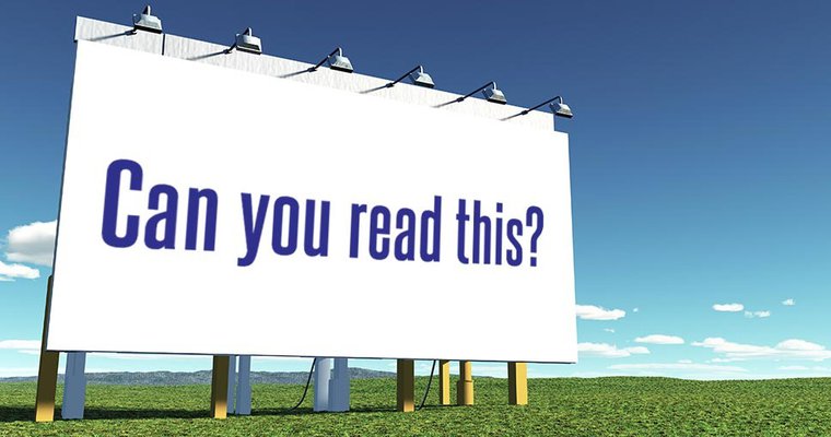
Sure, you’ve got an eye-catching image to draw people’s attention to your billboard or other signage as they drive by, but the information you want to share needs to be clear and concise or what’s the point?
 Provided
Jan. 11, 2022 | by Derek DeWitt
Sure, you’ve got an eye-catching image to draw people’s attention to your billboard or other signage as they drive by, but the information you want to share needs to be clear and concise or what’s the point? And the real thing to focus on here is your fonts. Choosing the right font and font style can make or break your roadside signage. There are a number of things to consider: font size, style, lower or upper case, spacing, alignment, colors, contrast with the background and the font choice itself.
Getting the most out of digital signs
Digital signs are becoming very much the standard for roadside signage across the country and bring a whole new set of considerations when designing messages for these signs, like is the image static or in motion? Generally, the best fonts to use for all outdoor messaging are sans serif fonts like Arial, Calibri, Futura, Garamond, Helvetica, Tahoma, Trajan and Verdana. And the font weight shouldn’t be too light either; thin letters are harder to see from a distance. Don’t use “fancy” fonts, like Brush Script or one of the Adobe Handwriting fonts. In fact, stay away from all script or gothic fonts.
Don’t use more than two different fonts for one message. More than that just confuses the eye. It’s probably best to just use one with different sizes and weights, but if you decide to go for two, make sure they are similar or related. This makes it easier to read and also gives your design a cohesive look.
 |
| Photo: iStock |
How fast someone is going past your roadside signage is also a factor. For example, if the speed limit is 35mph, the message should be visible for three seconds by passing drivers. This means the letters should be no less than seven inches tall, even as close as 100 feet. On a digital sign, that’s 18 pixels on a sign with a 10mm pixel pitch (which means the space between pixels is 10mm). It’s a complicated business, and the faster the person is passing by, the larger the letters need to be. Letters eight inches high can be seen for 1.8 seconds at 30 mph but that drops to 0.9 seconds at 60 mph.
Here’s a breakdown of the ideal speed and pixel pitch to use:
Speed Recommended Size Maximum Impact Size Minimum Size
35 mph 18 inches, 46 pixels, 35 point, 35 inches, 80 pixels, 67 point, 7 inches, 18 pixels, 13 point
45 mph 23 inches, 58 pixels, 77 point, 46 inches, 116 pixels, 155 point, 10 inches, 25 pixels, 19 point
55 mph 28 inches, 70 pixels, 119 point, 57 inches, 152 pixels, 243 point, 13 inches, 32 pixels, 25 point
As mentioned above, combining upper- and lower-case letter actually increases visibility. Instead of going all caps, try judicious use of bold instead. When it comes to spacing, try to keep it even. Crowding letters or words together on part of the message makes the whole thing seem uneven and out of balance. And there’s a good chance that, while people might notice there’s a message on the sign, they won’t actually dial in to receive the information because it just looks like too much trouble.
Keep in mind that people are subconsciously making the “decision” to read your message or not; it all happens in a split second. Generally speaking, it’s better to have your text a little larger than necessary than too small, so always err on the side of bigger.
Tips for best roadside signage
When designing content for digital signs in a building where the audience is most likely on foot, it’s common to think about an attention-grabbing image first. This is also true for outdoor screens at locations like bus stops. But when designing for roadside signage, the order gets reversed: start with the text and incorporate visual elements last.
The text is what the person will “take away” from your message, so it needs to be the focus of the entire design. You also have to assume that they will never come this way again, so you really want your information to lodge in their mind for impact and recall.
And there are other things to consider when designing your roadside signage:
- Lighting conditions – Does your sign get glare from the sun? If so, when? If it’s during peak traffic hours, simplify the message and increase the font size and contrast.
- Sign surroundings – What’s behind and next to the sign? Buildings, trees and even the open sky all add to the background of your message from the point of the viewer.
- Test it in the wild – If at all possible, create a test environment that mimics what your audience’s experience will be as closely as possible. Test and adjust repeatedly. The perfect scenario would be to get the message up on the actual sign and then drive past it yourself while listening to your favorite podcast.
Unless you own your own roadside signage, you’ll be working with an agency to place your message. Take advantage of their expertise and advice. If you can go digital, see if your agreement allows you to make adjustments over time. As with all advertising, testing and tweaking will be key.
INCLUDED IN THIS STORY
Visix Inc.
Manage your visual communications from a single browser-based CMS to reach people both in the office and working remotely. Create, import and schedule 100+ content types to displays, touchscreens, video walls, room signs, websites and enterprise messaging apps. Find out why 4000+ organizations trust Visix to help them communicate better.LEARN MORESelect to Request Info
Display TechnologyContent ManagementDigital BillboardsDOOH AdvertisingOutdoor SignageVisix Inc.
DEREK DEWITT
Communications specialist for Visix, Inc. and host of the award-winning Digital Signage Done Right podcast, Derek DeWitt uses 25+ years of education and storytelling experience to craft practical advice and resources for digital signage users.
CONNECT WITH DEREK:
DIGITAL SIGNAGE STRATEGY
Tips on how digital signage can improve internal communication
How digital out-of-home can meet the data privacy moment
What retailers need to know about digital signage with face detection
2022 Kiosk Marketplace Census Report2021 Kiosk Marketplace Census ReportCustomer Experience 4.0 Master Series: Transforming The Future of Retail Banking2020 Digital Signage Future Trends2020 Kiosk Marketplace Census Report2020 Digital Signage Hardware Comparison Guide2020 Digital Signage Software Comparison Guide

source https://duchonsigns.wordpress.com/2022/03/21/how-to-get-the-most-out-of-digital-roadside-signage/

No comments:
Post a Comment